Monday, 24 January 2011
Photography Planning
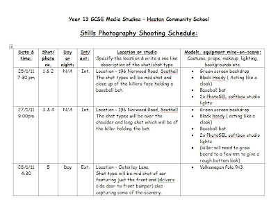
For my poster and magazine front cover, the initial plan was to use the pictures gained from when we was filming. However, due to the fact that when we was filming it was fairly dark, this caused the image to be unclear and not very effective. Therefore, I decided to use a green screen alongside a Nikon D5000 with a 18-105mm lens to take pictures of the killer and the vehicle. In the photography studio, the lighting used was PhotoSEL's Softbox Studio Lighting Kit which was purchased of amazon with 2x85w Bulbs. This enabled me to control the lighting in the studio which helped me gain an effect whereby half my face will be shaded in and the other half in light. For the pictures of the car, I decided to take pictures during the day rather then at night as at night, the visibility was very low causing the images to come out rather dark. Below is the photography shooting scchedule which I will follow:


Saturday, 22 January 2011
Production Logo
Wednesday, 19 January 2011
Friday, 14 January 2011
Tagline Ideas
For my poster, I wanted the tagline to be fairly effective without giving too much away. I also wanted to create a bit of enigma in order to make the audience ask themselves questions about the film. After a deep thought, I came up with the below taglines to use on my poster:
" No Laws.. No Limits.. One killer.."
I came up with the above tagline as I thought that in a forest there are no laws. "No Limits" came from the idea that the killer will go through anything in order to murder the four boys, hence not having a limit. Lastly, the two previous statements alongside the statement "One Killer" will draw up a image of the killer in the audiences head which.
"Pay Attention!"
Pay Attention came from the fact that the four boys didn't take notice of the sign which says not to trespass the forest as it is dangerous. Therefore, pay attention is suggesting that the four boys should of kept their eye out and read the sign which would of caused them to stay alive. This will also relate to the audience as many people do not pay attention to some sort of thing, hence this will make them think as to why to pay attention consequently will persuade them to watch the film.
"Be Careful... He Has A Weapon"
Lastly, the above tagline creates some sort of enigma as I do not mention who "he" is causing the audience to wonder who the poster is on about. This will cause questions to arise for the audience which should cause them to watch the film.
Wednesday, 12 January 2011
Typefaces

I decided to go for the above font due to the connotations in which the font holds. The sharp edges and flat straight lines help to make the writing readable, however, there are lines which are coming out of the letters as well as lines going through the letters. This can help link the poster to some horror conventions such as a knife. This will make the poster stand out from the rest as well as helping it identifiable it belongs to the horror genre.

Above is one of the fonts which I shortlisted to use for my film name due to the fact that the font looks like it is vanishing. In photoshop, I will edit the text to make the film name fade into the background towards the bottom which will link to the name, " The Vanishing".

For the tagline, the above font is what I will use. The reason for this is because the style of the writing links to the horror genre directly due to the rough and damaged lettering. There is also a liquid which seems to be dripping off the text which can be associated with blood. This will be highly effective for my poster due to the direct link and connotations the text gives off which is similar to horror characteristics too.
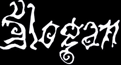
One of the fonts which caught my eye is the one in the above image. However, after analysing the text, I came to conclusion that it looks a bit ghostly. Due to the fact that my film is about knifes and death rather then ghosts and fear, I didnt want to give wrong ideas as what the film may contain which is why I didnt use this font.
Lastly, for the production crews names and the release date, the font will be in Arial Narrow as this font is fairly easy to read. Also, due to the fact that the production crews names and release date are information, I would like to keep some formality within the poster hence why the information for the film will be in a formal font.
Monday, 10 January 2011
Thursday, 6 January 2011
Introduction To The Creation Of The Film Poster
The second task was to create a poster for our film which had to be done individually. The material which will fund the poster will be from the filming days when we filmed our trailer. The procedure which I will follow is firstly to analyse various different horror posters in order to gather an understanding of what I need to include in my poster (conventions) and the various elements which is common amongst the horror genre. Secondly, I will start to flat plan which is roughly drawing out what the poster will look like in order to give me a visual idea of what the poster will look like. Once the flat plan has been designed, I will then look through the images I have and see if they are what I am looking for and up to a high standard, if not, I will plan a photography session. Lastly, I will put the poster together and repeat the above steps for the magazine front cover.
Subscribe to:
Comments (Atom)
