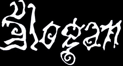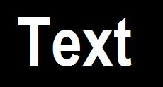
I decided to go for the above font due to the connotations in which the font holds. The sharp edges and flat straight lines help to make the writing readable, however, there are lines which are coming out of the letters as well as lines going through the letters. This can help link the poster to some horror conventions such as a knife. This will make the poster stand out from the rest as well as helping it identifiable it belongs to the horror genre.

Above is one of the fonts which I shortlisted to use for my film name due to the fact that the font looks like it is vanishing. In photoshop, I will edit the text to make the film name fade into the background towards the bottom which will link to the name, " The Vanishing".

For the tagline, the above font is what I will use. The reason for this is because the style of the writing links to the horror genre directly due to the rough and damaged lettering. There is also a liquid which seems to be dripping off the text which can be associated with blood. This will be highly effective for my poster due to the direct link and connotations the text gives off which is similar to horror characteristics too.

One of the fonts which caught my eye is the one in the above image. However, after analysing the text, I came to conclusion that it looks a bit ghostly. Due to the fact that my film is about knifes and death rather then ghosts and fear, I didnt want to give wrong ideas as what the film may contain which is why I didnt use this font.

Lastly, for the production crews names and the release date, the font will be in Arial Narrow as this font is fairly easy to read. Also, due to the fact that the production crews names and release date are information, I would like to keep some formality within the poster hence why the information for the film will be in a formal font.